Quick and Simple is Likeable Too

Today I’m presenting a piece that shows the insanity of creating art pieces. I love the way this turned out and I did it in 10 minutes. Other times I can take hours, days, or months to complete a piece and I absolutely hate it in the end.

Maybe I’m a little crazy to keep every single piece of art I create, be it a sketch or partially completed piece or a complete work of art. I do the same with every story I write. Throwing them away is like killing my kids. Even worse, our diva beagle who rates much higher in the order of children.

Anyway, I really like this piece. It’s a lot of fun to take everyday items from around the house and throw together a collage. There’s just something about shapes and my brain that go well together too. Building or creating with your hands is so satisfying.

Every time I look at this one, I feel inspiration to do something similar. For a long time I’ve wanted to hit all the thrift stores for items to use in a collage. Professing it here may get me out there quicker.

Have a great week!
Bride of Chucky

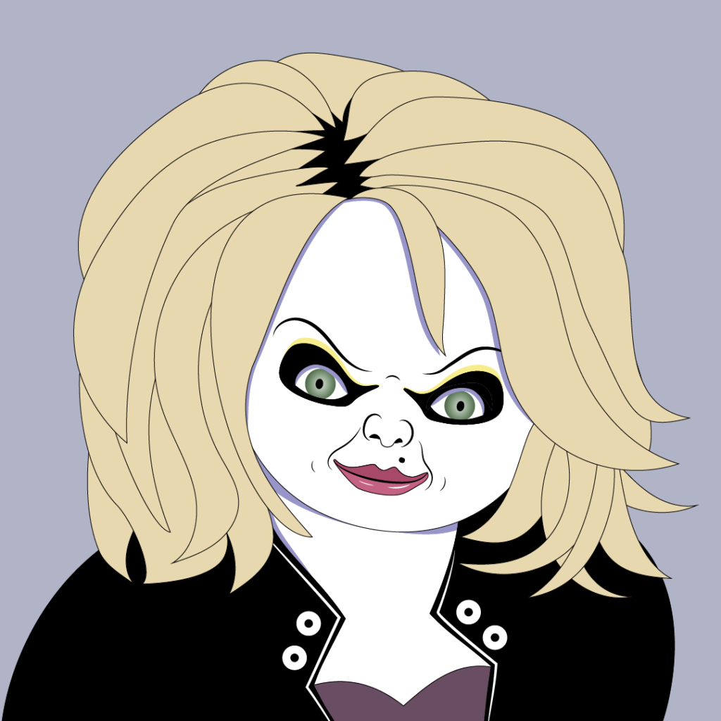
Look who joins the Ladies of Horror. Tiffany, Bride of Chucky, is done. Probably the most fun to do, especially around the eyes. Great horror comedy movie, and Jennifer Tilly is so good as Tiffany.

I actually finished this one over a month ago, but forgot to post her here. And I just finished Frank-N-Furter, but you’ll have to wait a few weeks to see Tim Curry here. The drawing is on my @meanwinniejean Deviant Art account if you want to see it now.

Sadly, Frank-N-Furter is the last Ladies of Horror I’m doing for awhile. I’m moving on to Grim Reapers or Zombies. I’m also refining the illustrations for a children’s book I wrote for a school project. It’s time that I publish the book. It will be a similar format to the Frog and Toad books.

That’s all this week. Have a great next week.

Note that this series is a mix of well known Ladies of Horror done in a Patrick Nagel style from the 80s. I started these to better learn the Pen tool in Adobe Illustrator, and they’ve become an obsession. If there’s a lady of horror you’d like to see, leave her in a comment. I will start them back up at around Halloween.

Kinetic Typography & My First Video Art

Quick and fast post this week to show off my first assignment for my Adobe After Effects class. It’s a quote from Crazy Eyes in Orange is the New Black in Kinetic Typography. I’ve wanted to do another one of these for quite awhile. This was so much fun to do. What is that, you ask?

Kinetic typography is “the technical name for “moving text”—is an animation technique mixing motion and text to express ideas using video animation. This text is presented over time in a manner intended to convey or evoke a particular idea or emotion.”

Wikipedia

Life Like Drawing

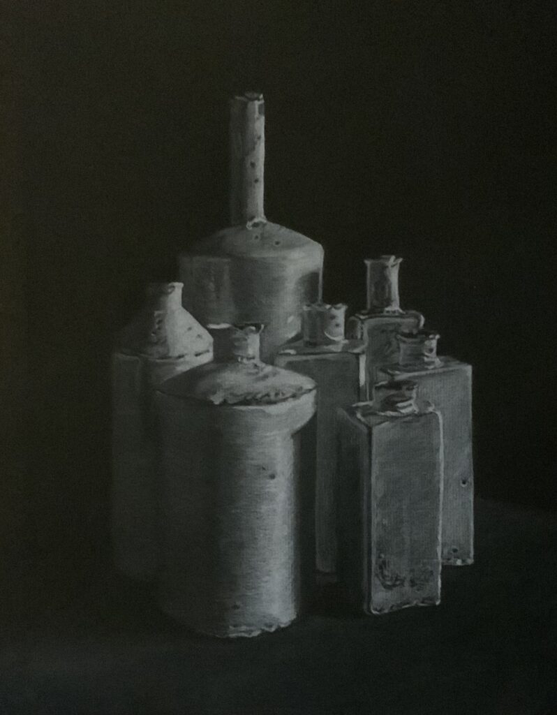
Showing off my ability to copy anything and make it look real this week. I love to copy with pencil in black and white in general. This was a fun assignment because it’s the opposite, the drawing done with white pencil instead. This one is framed on my wall, and most people approach thinking it’s a photograph.

I usually do life-like drawings in portrait form. I especially love doing old people because there is so much character in their faces, not to mention it’s a challenge to do the wrinkles.

If you are a writer and find keeping your manuscript clean of extra lines and spaces a huge challenge, I wrote a blog post you’ll find helpful. Manuscripts Are A Dirty Business: Remove The Extra Sections, Breaks, and Spaces Before submitting or Formatting Your Book is a great checklist to follow before you format your book. It strips out a lot of the formatting you don’t need and that can cause quite a few headaches, especially with eBook formatting. In general, it’ll help you keep your manuscript clean, and that’s the best option in MS Word because it can cause so many hidden issues with a document.

Minor news on Angels Dark and Dumb. Major progress on the covers and Margery. I know I keep promising this, but the reveal should happen next week. I’ll probably do it in a separate post from my weekly status and artwork post.

Until next week…

Ladies of Horror: Grace Jones as Vamp

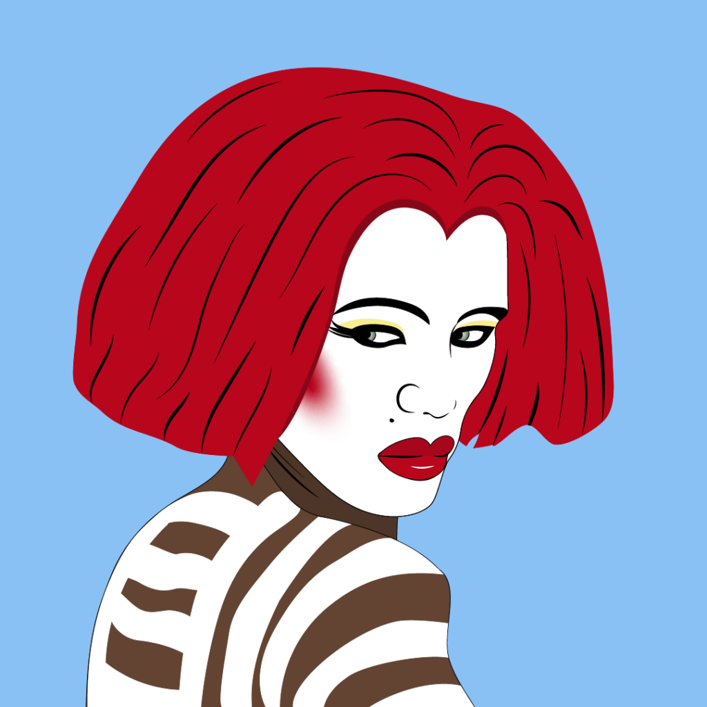
Another blast from the past with the movie Vamp, starring Grace Jones. The movie was released in 1986, and I remember seeing it in the theater. The 80s horror movies were filled with students getting in trouble with various types of monsters, and this movie is no different. For the trivia piece, Grace Jones doesn’t speak at all in the movie. While I went with one of her beautiful portraits that’s used on the movie poster, seeing her in true vampire form is worth a look. I love the red wig! I strayed from the usual purple color scheme because she needed the red hair and contrasting skin colors. I’m kinda regretting not giving her the striking blue eyes, but I can always change it later.

Reminder that this series is a mix of Ladies of Horror from TV and movies done in a Patrick Nagel style. I started these to better learn the Pen tool in Adobe Illustrator, and they’ve become an obsession. If there’s a lady you’d like to see, leave her in a comment.

Minor news on Angels Dark and Dumb. No news this week on cover progress and such. I have started a series of collages based on the characters I have in full body by the cover artist, Atrtink Covers. Look for them on my social accounts, links at the bottom of the page. Some for Margery have already posted. I’ll change to her full-body caricature once I get it. More coming for her and Barry, Trisha, Azael, and the hellhound in coming weeks.

Until next week…