Bride of Chucky

Look who joins the Ladies of Horror. Tiffany, Bride of Chucky, is done. Probably the most fun to do, especially around the eyes. Great horror comedy movie, and Jennifer Tilly is so good as Tiffany.

I actually finished this one over a month ago, but forgot to post her here. And I just finished Frank-N-Furter, but you’ll have to wait a few weeks to see Tim Curry here. The drawing is on my @meanwinniejean Deviant Art account if you want to see it now.

Sadly, Frank-N-Furter is the last Ladies of Horror I’m doing for awhile. I’m moving on to Grim Reapers or Zombies. I’m also refining the illustrations for a children’s book I wrote for a school project. It’s time that I publish the book. It will be a similar format to the Frog and Toad books.

That’s all this week. Have a great next week.

Note that this series is a mix of well known Ladies of Horror done in a Patrick Nagel style from the 80s. I started these to better learn the Pen tool in Adobe Illustrator, and they’ve become an obsession. If there’s a lady of horror you’d like to see, leave her in a comment. I will start them back up at around Halloween.
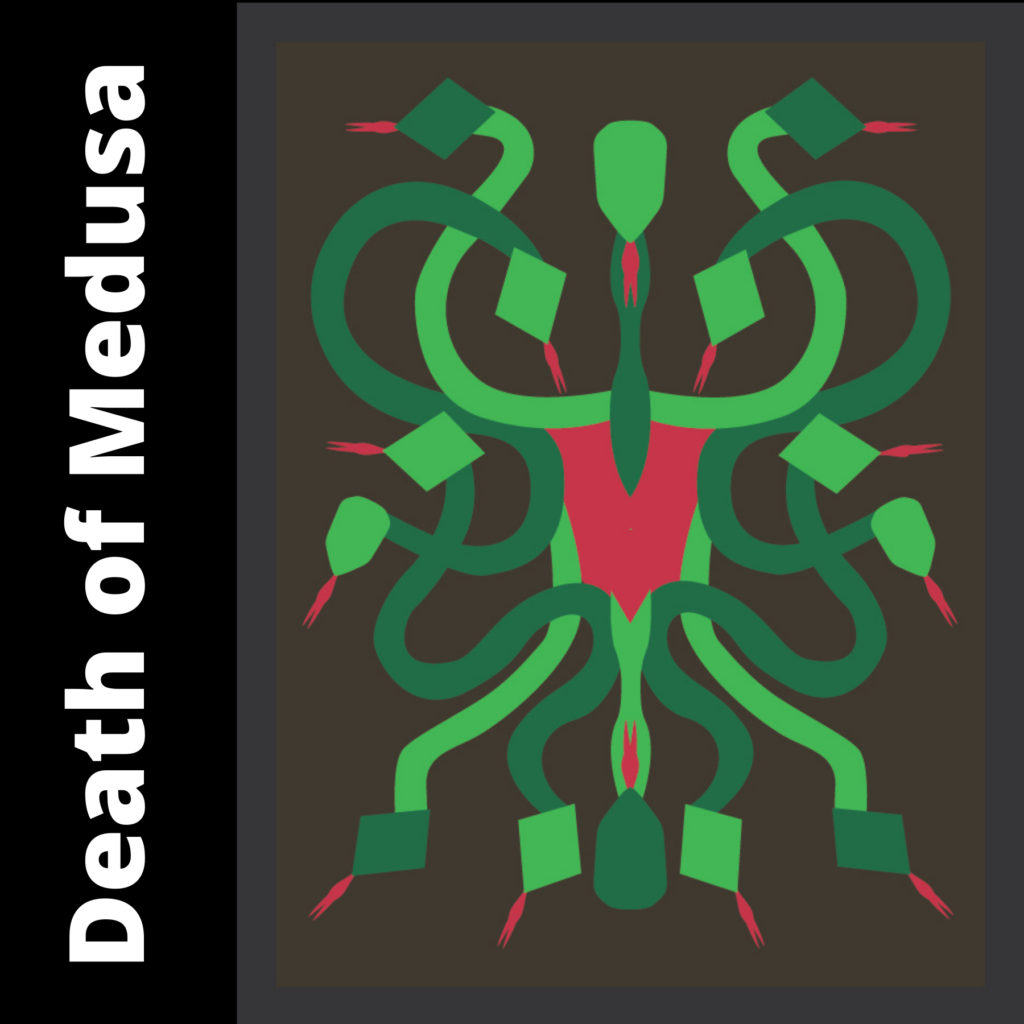
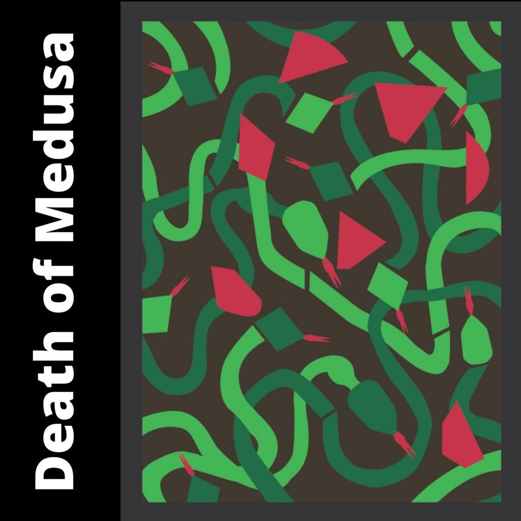
Death of Medusa

For the last week, I’ve mostly been working on other people’s or writer’s artwork and books, so I dug through the archives again. This is another school project I’m thinking I’d like to revisit with a different subject matter. Hmm… What might I do, because ideas are half the battle?

The subject of this piece is obviously Medusa. What makes it so fun is that it is a deconstruction as you can see in the second image. This was originally done as a construction paper cut out. Each side was in balance to start, and then I cut the pieces to complete the deconstruction.

Fitting for a horror comedy writer and artist to have a love of scissors. I do a lot of pieces by first cutting out shapes to create templates, especially if they are geometric pieces. Then I like to bring these into Adobe Illustrator and trace them.

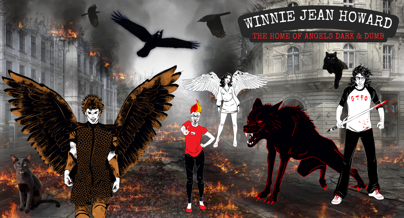
Minor news on Angels Dark and Dumb. I received an updated look at the Margery character drawing and it’s a hoot. I can’t wait to unveil her. Otherwise, covers are almost done too.

Until next week…

Having a Proud Artist Moment

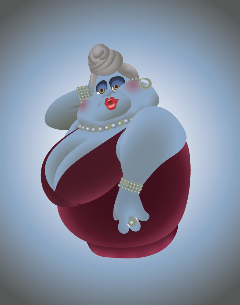
Finished another Lady of Horror this week. Fatso is a character in the Casper movie released in 1995 that includes Christina Ricci as one of the main characters. Fatso is in drag as Amelia, her deceased mother, to fool her father. Very very funny scene! I watch the movie every Halloween. Brad Garrett does the voice of Fatso perfectly! Interesting fact, Casper was “the first feature film to have a fully computer-generated visual effects character in a leading role.”

The Ladies of Horror series is a mix of feminine horror actors done in a Patrick Nagel style, although I kept the integrity of the character because Fatso wouldn’t look good without depth. I started these to better learn the Pen tool in Adobe Illustrator, and they’ve become an obsession. Now, with this one, I’ve mastered gradients…well kinda. If there’s a lady in a horror movie or TV show you’d like to see, leave her in a comment.

While this is my first try at a major use of gradients in Adobe Illustrator, I’m quite pleased with how it turned out. Can’t wait to start a new project with gradients! Not at all sure what I want to do, but I feel it should be something original. Maybe I’ll try the Grim Reaper, who is a character I’ve mentioned in a book I wrote awhile back but never published. I want to revisit the book as a graphic novel.

No news on Angels Dark and Dumb. The cover artist is still working on the updates, but she’s getting close. Until next week…

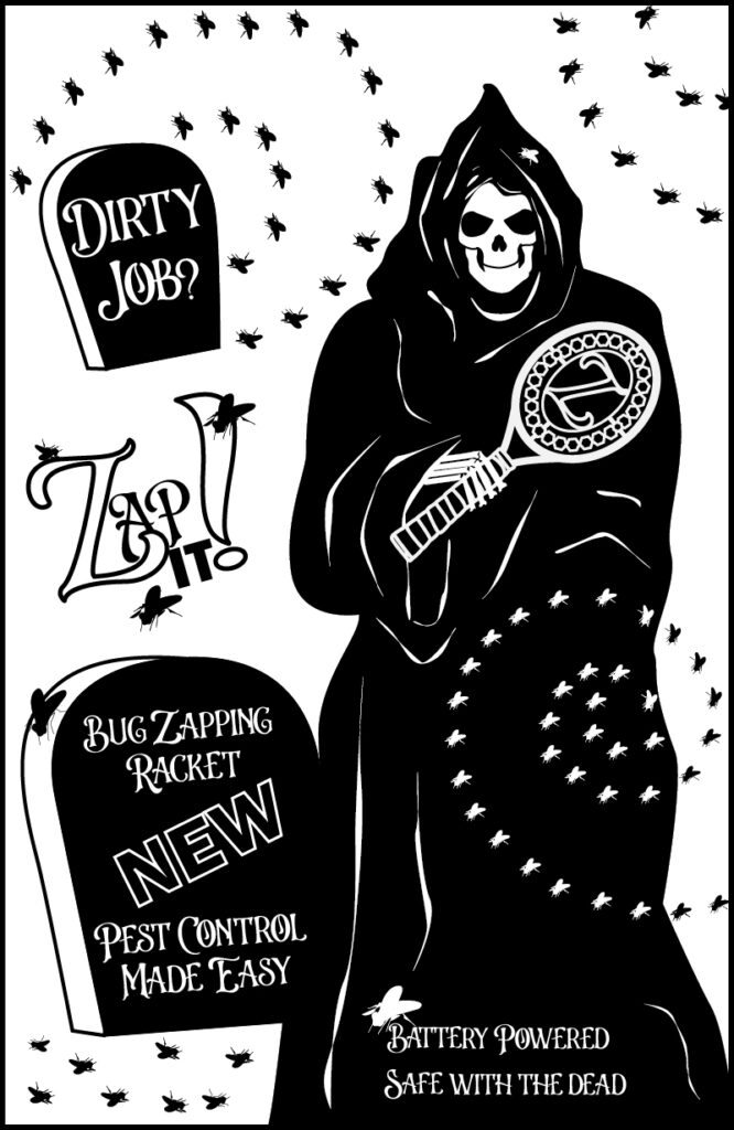
Revisiting a School Project Featuring the Grim Reaper

This week I’m revisiting a project from school a few years ago. I did this for my Illustration class. Believe it or not, Zap It! is a real product for swatting flies. Google it! We had to take the style from another artist and make an ad in that style for a modern day product. As usual, horror comedy was a theme in my work. As you may have guess, this was done in Adobe Illustrator.

For the artist, I chose Aubrey Beardsley, one of my favorites, who died way before he was able to truly fulfill his potential. He created illustrations for Oscar Wilde, which is another reason to love him. And Beardsley was a huge contributor to starting poster art, so choosing his style for something like this is kinda a given.

Why share it now? Because I’d like to start a series of grim reapers. Why a series of grim reapers? Because I wrote a short story about the Grim Reaper’s son that I outlined into a book. Hmmm… Is there a pattern with me here? Writing stories about sons and fathers. Actually, I’ve written quite a few short stories about Grim. I should drag them all out and reread them.

Otherwise, I’ve made no progress on Angels Dark and Dumb except for some work on cover copy. Covers are still being revitalized. And Lydia Deetz is in the works and will hopefully be in next week’s status post. Have a great week!