Lurking Psycho Clowns

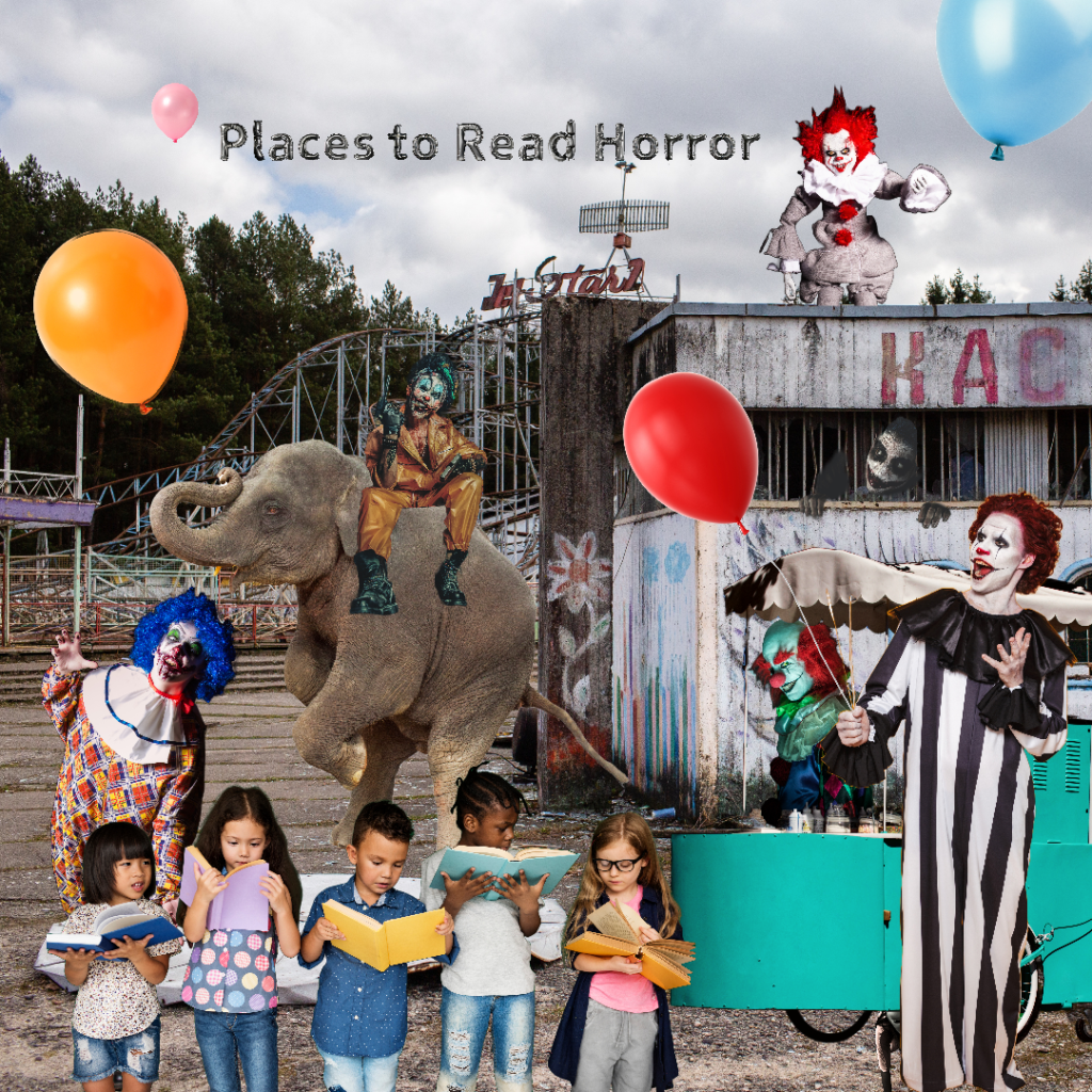
I haven’t shared one of my Places to Read Horror collages for awhile, so here’s one of the latest I really love.

Yes, I’m one of those people who finds all clowns creepy. I remember going to the circus when I was a kid, and they were more fascinating in a bad way, especially the sad clowns. As an adult, it’s all about the horror clowns in movies and such. There are tons of creepy clown pictures out there, so I’ll be doing many more of these.

This was done in Adobe Express, which I’m slowly switching to because the images come out a lot better.

Up to this point, I’ve done quite a few of these, all available for the best viewing on my @meanwinniejean Instagram account.

Until next time…

Life Like Drawing

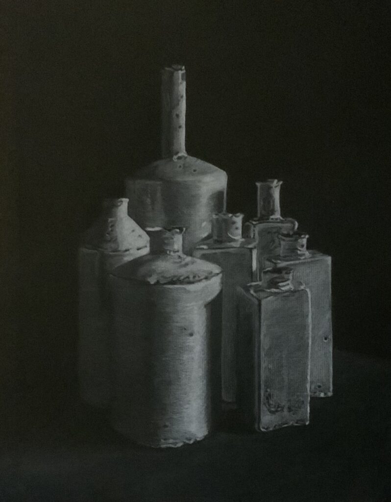
Showing off my ability to copy anything and make it look real this week. I love to copy with pencil in black and white in general. This was a fun assignment because it’s the opposite, the drawing done with white pencil instead. This one is framed on my wall, and most people approach thinking it’s a photograph.

I usually do life-like drawings in portrait form. I especially love doing old people because there is so much character in their faces, not to mention it’s a challenge to do the wrinkles.

If you are a writer and find keeping your manuscript clean of extra lines and spaces a huge challenge, I wrote a blog post you’ll find helpful. Manuscripts Are A Dirty Business: Remove The Extra Sections, Breaks, and Spaces Before submitting or Formatting Your Book is a great checklist to follow before you format your book. It strips out a lot of the formatting you don’t need and that can cause quite a few headaches, especially with eBook formatting. In general, it’ll help you keep your manuscript clean, and that’s the best option in MS Word because it can cause so many hidden issues with a document.

Minor news on Angels Dark and Dumb. Major progress on the covers and Margery. I know I keep promising this, but the reveal should happen next week. I’ll probably do it in a separate post from my weekly status and artwork post.

Until next week…

Ladies of Horror: Grace Jones as Vamp

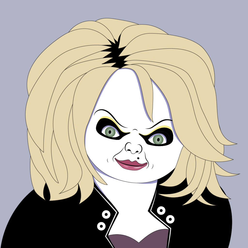
Another blast from the past with the movie Vamp, starring Grace Jones. The movie was released in 1986, and I remember seeing it in the theater. The 80s horror movies were filled with students getting in trouble with various types of monsters, and this movie is no different. For the trivia piece, Grace Jones doesn’t speak at all in the movie. While I went with one of her beautiful portraits that’s used on the movie poster, seeing her in true vampire form is worth a look. I love the red wig! I strayed from the usual purple color scheme because she needed the red hair and contrasting skin colors. I’m kinda regretting not giving her the striking blue eyes, but I can always change it later.

Reminder that this series is a mix of Ladies of Horror from TV and movies done in a Patrick Nagel style. I started these to better learn the Pen tool in Adobe Illustrator, and they’ve become an obsession. If there’s a lady you’d like to see, leave her in a comment.

Minor news on Angels Dark and Dumb. No news this week on cover progress and such. I have started a series of collages based on the characters I have in full body by the cover artist, Atrtink Covers. Look for them on my social accounts, links at the bottom of the page. Some for Margery have already posted. I’ll change to her full-body caricature once I get it. More coming for her and Barry, Trisha, Azael, and the hellhound in coming weeks.

Until next week…

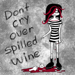
Drink Til You Puke

Going back to an old class project again this week. The assignment was to choose some art styles, and this one is Punk art. This style tends to have words and look more poster-ish. Did this in Canva and Adobe Photoshop.

Have been playing around with Adobe Express, which used to have a different name. It’s basically equivalent to Canva. I think I prefer it because they are doing a better job of integrating their AI image generator. I generally prefer navigation around the screen there too. I have used Canva forever and I think I just got too settled using it.

Minor news on Angels Dark and Dumb. I was able to review updates to Barry on the first 2 book covers. And Margery is done, but I’ll wait until next week to reveal her. Everything should be done by then, and I should be able to republish everything as well.

In other exciting Angels Dark and Dumb news, I’m making progress on the updated outline. I finished a pass through it and am still happy with the general story. I’m not happy with Barry’s character arc, so that will require another pass through the outline. The good news is that I plan to release the book on Vella as it’s being written, so you won’t have to wait 10 years for another book.

Until next week…

Death of Medusa

For the last week, I’ve mostly been working on other people’s or writer’s artwork and books, so I dug through the archives again. This is another school project I’m thinking I’d like to revisit with a different subject matter. Hmm… What might I do, because ideas are half the battle?

The subject of this piece is obviously Medusa. What makes it so fun is that it is a deconstruction as you can see in the second image. This was originally done as a construction paper cut out. Each side was in balance to start, and then I cut the pieces to complete the deconstruction.

Fitting for a horror comedy writer and artist to have a love of scissors. I do a lot of pieces by first cutting out shapes to create templates, especially if they are geometric pieces. Then I like to bring these into Adobe Illustrator and trace them.

Minor news on Angels Dark and Dumb. I received an updated look at the Margery character drawing and it’s a hoot. I can’t wait to unveil her. Otherwise, covers are almost done too.

Until next week…